

How to Design and Publish Your Website in 2026 With Framerstacks

By
A. Rishad
Blog
—

800+ section & components
Components every week
50+ Custom forms
Complete UI kit
CMS collection
Premium templates
One-time payment starts from
Sign in, if you already have an account.
Have questions? Contact us
It's a little challenging and time-consuming process to build a website from scratch. Are you still designing your website from scratch? It's 2026, and you should work smart on your mission.
Framerstacks is here to help you from post-production to hitting the publish button at the final stage.
Let's break down the steps that reveal how easy to design, optimize, and publish a website faster without compromising the design quality.
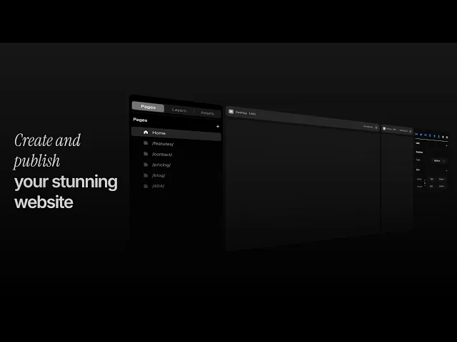
Don't wish to read? Watch the full video guide for better visual understanding.
What is Framerstacks?
It's simply a tool that helps users to create and publish their website faster without compromising in design quality. This tool contains 700+ pre-built Framer components, sections, and variants. The new assets are still being added every week.
Framerstacks is not a free tool, because we are offering the best possible design system and premium templates to our users in high-quality formats. So, if you wish to, visit our pricing section and get to know more about our plans.
Let's explore how Framerstacks speed up your web design process, all the way to publishing your website.
Create a project file in Framer
As we are offering pre-built Framer sections and components, you have to create an account on Framer and start a new project file.

First, find a name for your project that you wish. Later, you can change it. Remember, before you assign a name, we recommend you to own a domain name from an authorised provider at a reasonable price range.
You can also find a domain name from inside Framer. A domain name is mandatory to display your content in search results.
Know your breakpoints
After you successfully create a project file, you can get access to the design canvas. A design canvas is a free space to design your web page efficiently.
When you first enter to the canvas, there will be only one breakpoint, and that is the primary one. Based on your requirement, you can add as many breakpoints as possible that respond to respective screen sizes.
Remember, whenever you make any changes to the primary, it will reflect on all other child breakpoints. But if you make any custom changes to the child, it will not be applied to the primary breakpoint.
Follow the upcoming steps to arrange your different breakpoints purposefully.
Pre-set your breakpoints
By default, you can create 3 breakpoints for the web page design. Desktop (primary), Tablet, and Phone. If you wish to, you can also create custom breakpoints.

Follow the exact resolutions for best practice.
Desktop: 1440 px
Tablet: 810 px
Phone: 390 px
The above format is standard. Stick on it for a better visual hierarchy.
Other parameters
Consider taking control of these settings on your breakpoints, such as breakpoint color styles, padding, gap, direction, overflow, and finally, accessibility.
Let me explain to you why each setting is important and should not be omitted.
Color style
Your breakpoint should have a color or a combined color style (theme-responsive). For visually appealing color combinations, we recommend using the Color Contrast plugin (Available for free in the plugin marketplace).

Padding
Yes, it matters. Padding means the space between the content and the border of your inserted stack. Never skip this part. Usually, we recommend to our users follow;
Padding style

T-Top: 50px
B-Bottom: 50px
R-Right: 20px
L-Left: 20px
This is the standard format for the Desktop breakpoint. Adjust for mobile devices if necessary.
Gap
By default, there will be a gap of "10" for the primary breakpoint. The same gap will be distributed across all the child breakpoints.
Recommended gap for the desktop and tablet will be "30" and for small aspect ratio devices, "10"
Direction
It means the content distribution direction. For desktop and tablet, it will be horizontal direction as the screen sizes are wider, but for mobile devices, the direction should be vertical to distribute the content downward and be compatible with the screen sizes.

Give a try to the "Grid" property. It enables an option to change the direction automatically based on the screen size.
Overflow
Don't think more about overflow property. It only matters when you want to use sticky elements on your webpages or wish to add the scroll property to a layer with a fixed height or length.

If you are not using both of these options, forget about "Overflow" because it is set to "hidden" by default.
Accessibility
This is the most important part of your web development process. Giving proper tags for the frame can improve the user experience, the right way of navigation, and content accessibility for search engines.

So, right after you design a section, element, or even component, it is essential to assign a tag from accessibility tag to improve the overall performance of the web content.
Consider all of the above-mentioned parameters, and make adjustments based on your web design. Once you done with all, you are good to go and start importing the necessary elements to your canvas that adaptive to your adjustments.
Bring sectiong or components to your canvas
Once you have pre-set all the necessary steps, it is time to bring the actual content to the canvas.
Head over to Framerstacks library page. Oops, the components and sections library page is locked? it means you are not signed in.
All the elements in the library page will be unlocked and ready to export right after you complete the sign-in steps and create your account.
Successfully created an account? Great, now the copy button will be unlocked, and you're allowed to copy the selected section or component and paste it into your project canvas.
Follow these steps on our doc page to know how you can do it easily.
Proper arrangement of your assets
Right before jumping into the content optimization step, make sure you have arranged all the elements of the page content in the correct order.
For instance, the nav bar should be at the top, whereas the footer at the bottom, and all other sections are aligned in between these two pillars in the right order.
Sometimes, the distribution will be random on the mobile breakpoint. To keep the consistency across all the devices, it is essential to double-check that all the elements in each breakpoint should be stacked in the exact order.
Optimization steps
Of course, the optimization step and time to invest in a proper direction are crucial. Most of the sections inside the Framerstacks are restricted to a Max width of "1200px" in size.
Maybe you're designing your content for a larger screen size. At this point, you should change this property for improved visual hierarchy.
Refer to the other optimization key factors listed below:
Content theme
The section or component you inserted into the canvas may not sync with your actual design theme. For the dark theme, it may not affect because all the primary variants of the section we designed in dark.
If you want to design your whole web content in light theme, just change the variant to light theme from the component property panel.
In case you wish to incorporate the dark and light theme that responds to the system or toggle theme, change to color assets to a multiple color property, or Contact us (Our design team will deliver you a theme responsive variant).
Font size and style
Undoubtedly, the sections you import from Framerstacks may not have the right font style or sizes. It depends on the content type and nature.
At this point, you should change to the right font family and font size that highlights your web page content quality.
Follow the properties below for the normal minimalistic styling.
The normally recommended font sizes are:
Desktop and tablet: "16px"
Mobile device: "12px" to "15px"
Commonly used font styles are:
Sf Pro Display (Apple font)
Inter
Poppins
Satoshi
Roboto
Instrument Serif
Optimized character spacing:
Headings
Letter spacing: "0"
Line spacing: "0.02"
Paragraphs
Letter spacing: "0"
Line spacing: "0.05"
Variants
Understand that you are not importing a single variant to the canvas. Instead, multiple variants that have different color properties and aspect ratios. You can see this in the component property panel.
All the Framerstacks sections have four or more variants that focus on different theme colors and screen sizes.
The primary variant is for Desktop, and the child variants are for tablet or phone devices. On each breakpoint, we advise you to change to the right one.

The theme and breakpoint names are clearly mentioned on the property panel to avoid any misuse of the variant that eventually leads to weird optimization practices.
Publish your website
Wolaa… Congratulations if you have successfully checked all the checkpoints depicted above.
Before taking the final step, that is, hitting the publish button. It is highly recommended to connect your project with a custom domain, that helps you to visible and rank you stunning website content on search results (SERPs).
Moreover, connecting with a custom domain also provides you an open access to the live analytics and performance tracking, both inside Framer and integrating with Google Search Console.
Done all? You're good to go and hit the publish button now.
A full video guide
Would you like to watch a full step-by-step guide in a video format?
Follow the exact steps mentioned in the video and practice to yield the best. All the best.
Need any assistance? Contact us
Got an article suggestion? Let us know