Search a component or section
Available variants
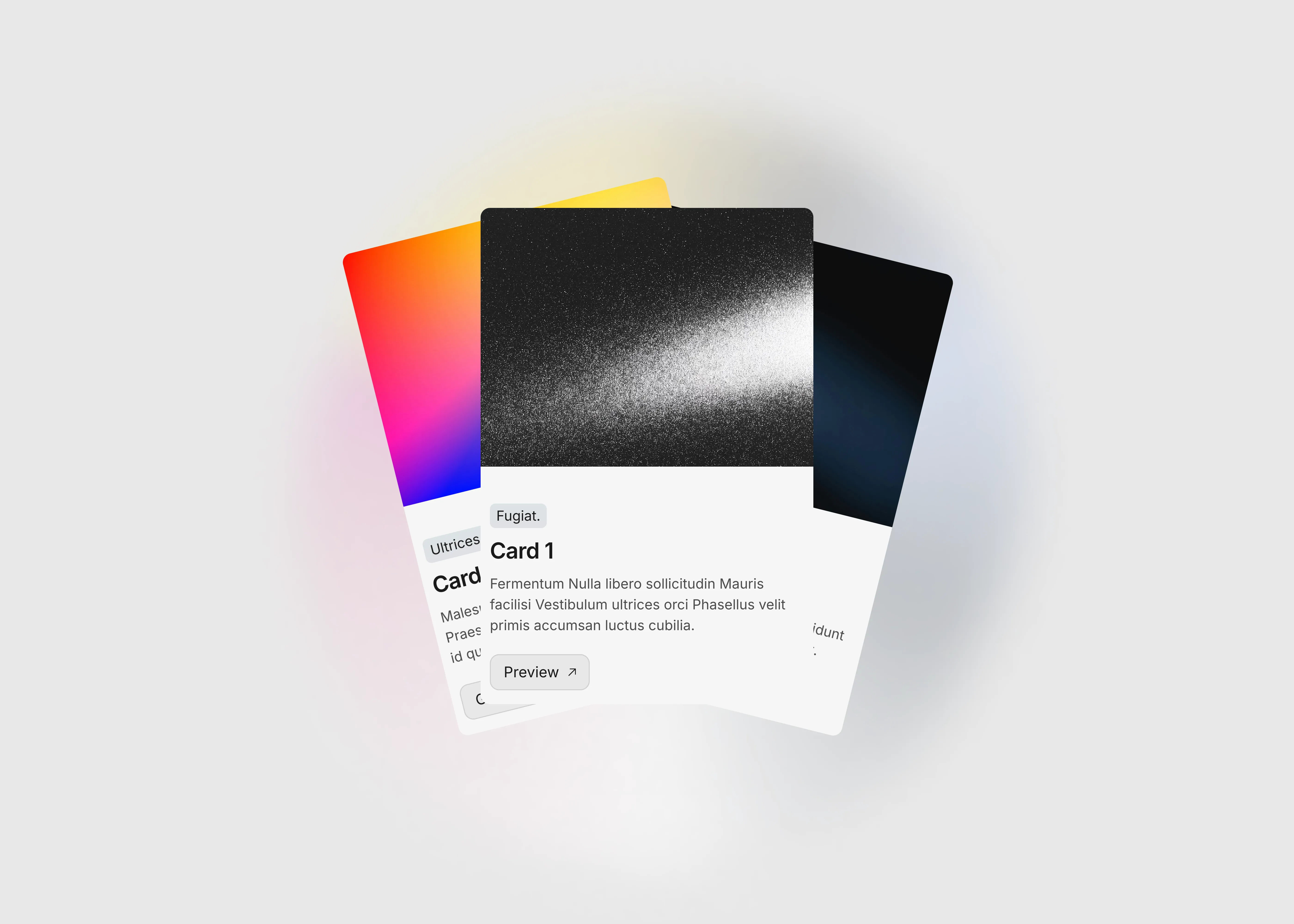
Library overview
Framerstacks hosts one of the largest collections of pre-built Framer components and website sections. With 200+ professionally designed components and 800+ variants.
Our library spans 40+ webpage section categories, enabling creators to build beautiful, high-performance websites in Framer faster than ever.
Explore the main library page.
Contribution
Have something creative on your mind? Or wish to become a contributor inside Framerstacks?
You're welcome. Join as a contributor and help to shape the future of high-quality Framer components and sections gallery. Head over to the submission page and contribute.
Support
If you need any further support related to this specific component or section, please send an email to hello@framerstacks.com
One of our customer support team members will get in touch with you within 24 hours.
To report an issue with the product, purchase, functionality, submit a ticket.
Just like more components


The FAQs
Have questions? We got you…
Everything you need to know about our product and billing.
" height="145.6071412712696px" id="yQXBZZpLX" width="80.09859047311576px"/></svg>)
What is Framerstack?
Is there a free plan available?
What about the refund policy?
How I can avail my user license?
Still have questions? Or can't find the right answer? Please contact us. One of our customer support team members will get in touch with you.
Join to the community
Stay in the loop with everything you need to know.