
Last updated on:
Updated on:
Available variants


Product Quick View Modal with Color Swatches
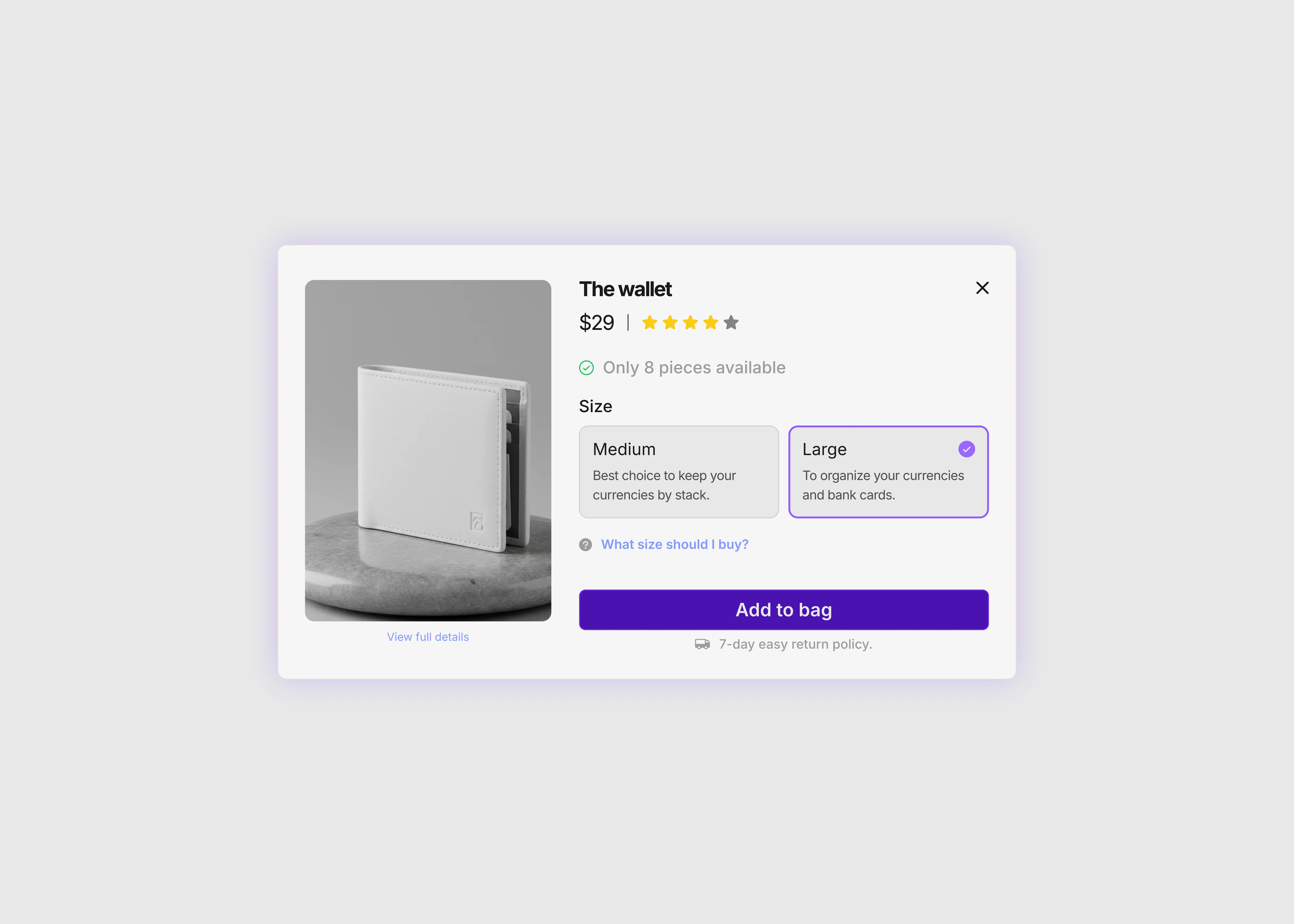
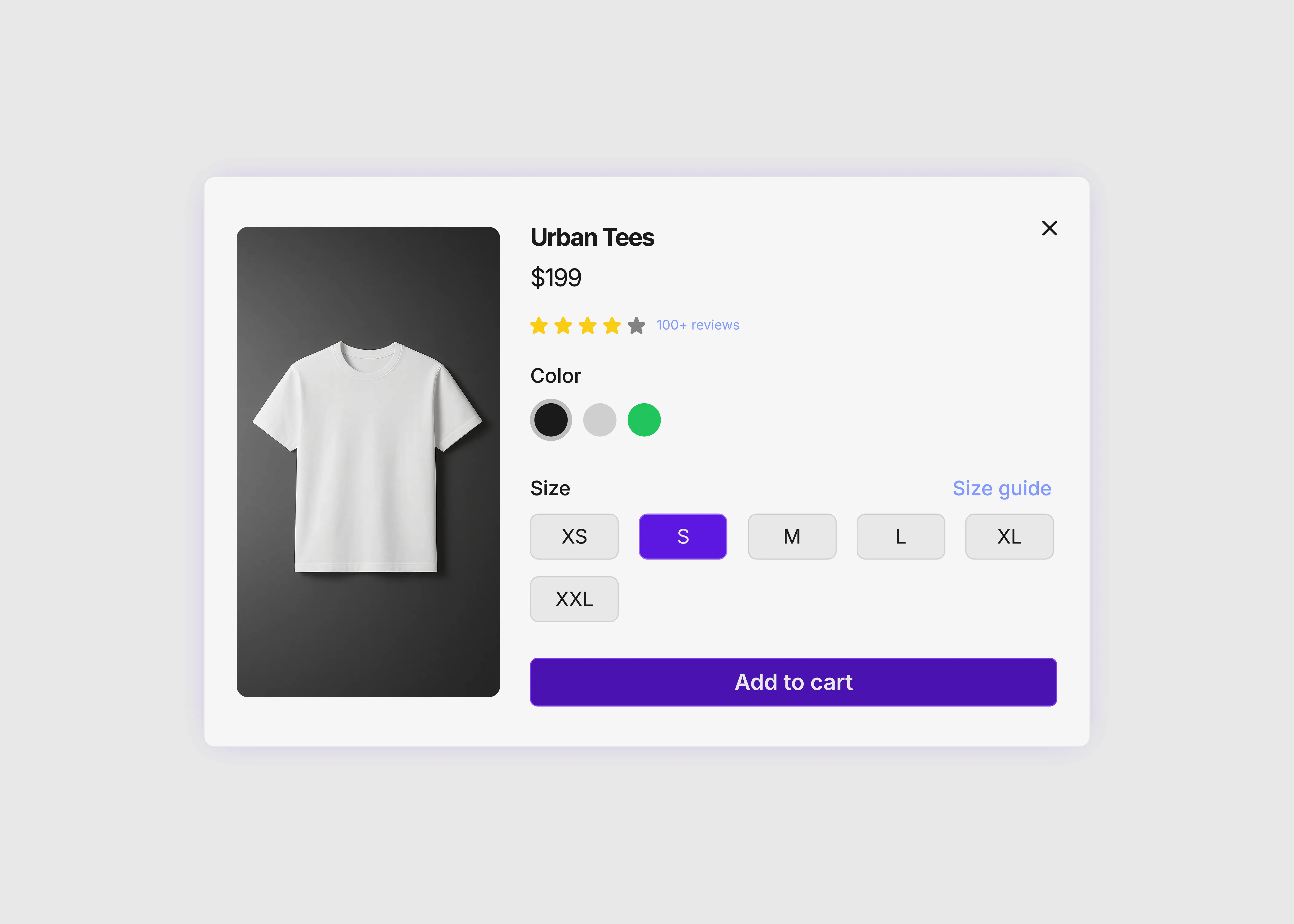
This product quick view modal for Framer lets shoppers check a product and add it to the cart without leaving the page. Picking a color changes the photo, button, and stock line, and the quantity stepper updates the total.
Variants:
4
Breakpoints
Theme:
Please note: This component is available only for active license holders. Sign in with your license key or purchase one.
Copying disabled
How to use the component?
Use the copy button above, then paste the component into your Framer project.
You need a standard member account to copy, so sign in first if nothing happens when you click.
A quick view works best as a popup. Add a Quick view button to each product card, make that button open an Overlay, and put this component inside the Overlay.
Use the Desktop variant on desktop and tablet, and the Phone variant on phones. Both come in Light and Dark. Desktop is 800 wide and Phone is 390 wide.
The X button does not close anything until you connect it. Select the component, find On Close in the right panel, and set it to close the Overlay. Turn on backdrop closing too, so shoppers can click outside the popup to leave.
Add your own photos in the right panel. Solar Image, Clay Image, and Blush Image each belong to one color swatch. Square photos with a plain background look best.
The Clay photo has a Clay Tint layer on top that turns a white background into the clay color. If your photo already has a colored background, hide that layer in the Clay variants.
The product name, price, specs, sticker, and shipping label are normal text inside Product quick view 4 Panel. Edit them there and every color updates.
The Finish label and the stock line change with each color, so edit those in each color variant.
To change a color, update the swatch, then set the Accent color on the Buy layer in that variant. The button follows it.
Quantity lives in Product quick view 4 Buy, which has one variant for each amount from 1 to 5. The total on each button is typed by hand, so update all five when you change the price.
Add to cart shows a short confirmation and then resets. It does not connect to a store by itself. Link the button to your Shopify, Lemon Squeezy, or checkout page so the sale can go through.
Link View full details to the real product page. Some shoppers want more photos and reviews before they buy, and this gives them an easy next step.
Text and prices sit inside the component, so make one copy of it for each product you want to show. Keep the copy short, because shoppers open a quick view for fast facts.
Keep the sticker and stock line honest. A real discount and a real stock number help people decide, and they build more trust than a made-up one.
More layouts are in the product quick view collection.
To build out your store, add product listings for your catalog and shopping carts for the last step.
Where to use?
Shop pages, collection pages, and product grids are the best fit. People can check many products quickly and stay on the same page.
It sits well on top of a product listing, and it also works on a single-product landing page, opened from a Buy now button.
It suits products sold in a few colors, like headphones, bags, shoes, and home goods.
LIMITED TIME OFFER
Launch amazing websites with
Framerstacks
Still trying to design and launch a website from scratch? Check out 800+ pre-built Framer components and sections that 10x your design speed.
Life time access
Save hundreds of hours
10x design speed
Weekly new releases
Premium designs
Color theme responsiveness
Starts from
$79.00
$99
One-time
Library overview
Framerstacks hosts one of the largest collections of pre-built Framer components and website sections. With 270+ professionally designed components and 1000+ variants.
Our library spans 120+ webpage section categories, enabling creators to build beautiful, high-performance websites in Framer faster than ever.
Explore the main library page.
Contribution
Have something creative on your mind? Or wish to become a contributor inside Framerstacks?
You're welcome. Join as a contributor and help to shape the future of the high-quality Framer components and sections gallery. Head over to the submission page and contribute.
Support
If you need any further support related to this specific component or section, please get in touch at hello@framerstacks.com
One of our customer support team members will get in touch with you within 24 hours.
To report an issue with the product, purchase, functionality, submit a ticket.
Just like more components
The FAQs
Have questions? We got you…
Everything you need to know about our product and billing.
" height="145.6071412712696px" id="yQXBZZpLX" width="80.09859047311576px"/></svg>)
What is Framerstack?
Is there a free plan available?
What about the refund policy?
How I can avail my user license?
Still have questions? Or can't find the right answer? Please contact us. One of our customer support team members will get in touch with you.
Join to the community
Stay in the loop with everything you need to know.
By clicking Submit, you agree to our Privacy Policy and to receive our notifications. You can Unsubscribe anytime.
By clicking Submit, you agree to our Privacy Policy and to receive our notifications. You can Unsubscribe anytime.