


Steps to design a simple navigation bar on Framer

By
A. Rishad
Founder @framerstacks
—

800+ section & components
Components every week
50+ Custom forms
Complete UI kit
CMS collection
Premium templates
One-time payment starts from
Sign in, if you already have an account.
Have questions? Contact us
A navigation bar is the most important part of a web design. It guides users to find quickly what they are looking for, gives an outline of your brand, and helps to drive conversions.
This blog content will break down every single step to design a very simple navigation bar for your Framer website that will respond to all screen sizes by using different variants for each breakpoint.
Our goals with this tutorial
A sticky navigation bar is placed at the top of the screen.
Navigation bar with proper data (Logo, useful page links, dropdown, CTA buttons.
A responsive navigation bar for all screen sizes.
Mobile navigation bar with special menu list arrangements.
Let's build it from scratch by following the steps below
OR
You can start designing from pre-built navigation bars. Checkout the library collection here.
Tired of reading? Watch this full guide on YouTube.
Draw a stack
First things first, just draw a stack by pressing the "F" key on your system keyboard. This is considered the space for the navigation bar.
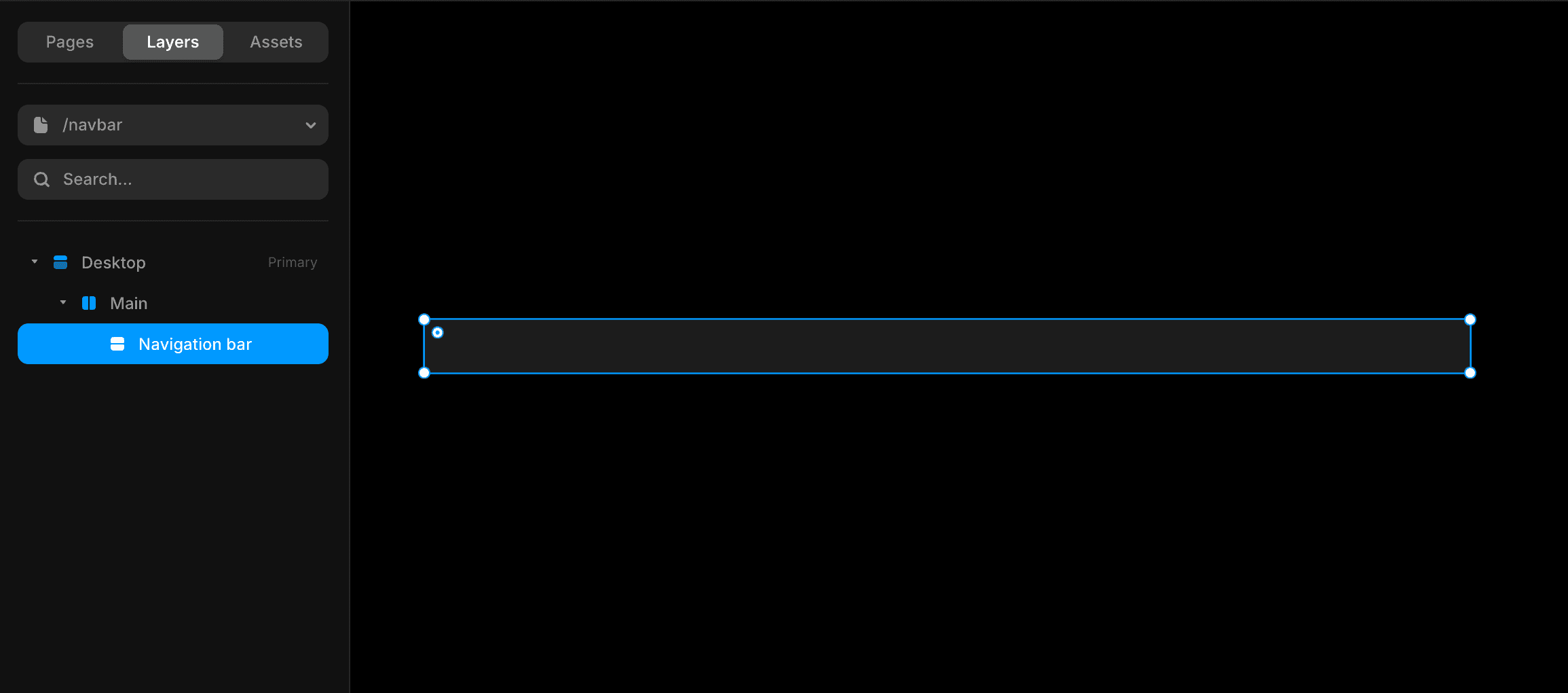
All the elements you want to add to the navigation bar should be placed inside this stack. Let's rename it to "Nav bar" or any other suitable name that you wish to assign. Or, press the Option+R button on your keyboard to auto-name the stack.
Optimize the stack (Navigation bar)
Let's make it more visually optimized.
First, fix the navigation bar's length. Recommended size is 1000px (Fixed) or use Fill to utilize the full length of the breakpoint. And, the height-to-fit mode.
Note: Enable the layout property to implement the following steps and distribute the content inside the navigation bar in a well-structured way.
Secondly, add padding to the navigation bar. The recommended value is 10. Then, add Radius with the same value 10 or leave it at 0 if you don't want to curve the edges of the nav bar.
Finally, just set the stack direction to down. This adjustment will help you out to design the mobile variant efficiently.
The pre-setting process is done very well. Just look at the stack; it is now ready to receive any element that will be automatically distributed to the available space.
Here is a quick review of the above-described steps for skimming.
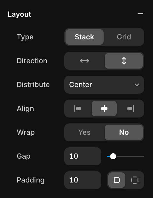
Width= 1000px
Height= Fit (Add an element to make this property functional)
Layout= Enable
1. Type= Stack
2. Direction= Down
3. Distribution= Centre
4. Align= Centre
5. Gap= 10
6. Padding= 10
7. Radius= 10 or leave it zero
Add a fill color to the nav bar
Add a text button to it
The complete steps to add a text button to the available space will be described in the following steps.
Add elements to navigation bar
Of course, this is the stage to add your brand logo, text buttons, and call to action buttons (Sign up, Buy now) to the navigation bar to guide the visitors or users across the website.
To create your brand logo, head over to Looka.
To add text buttons, check out Framerstacks component gallery page and copy the proper button that you can gully customizable at your end.
Once the logo and text buttons are added to the stack, it is the best time to add CTA buttons, which help you to drive more conversions to your business. After that, the primary design process of the navigation bar has completed.
The further steps focus on creating variants that automatically become responsive to specific screen sizes.
The recommended variant sizes are:
1000px
810px
390px
Just create variants. But first, you need to convert the navigation stack into a component. Follow the steps below.
Convert to a component & add variants
Select the navigation stack
It is important to choose the stack to let the Framer know which thing you want to make a variant.
Use the Framer shortcut
So easy to create a component in Framer. Press Command + Option + K on Mac
OR
Ctrl + Alt + K on the Windows operating system.
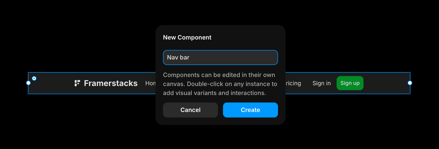
After pressing that, name your component. For instance, "Nav bar" and press the Create button.
This will take you into a new free canvas, which has only the newly created navigation bar. This is the canvas, where you can freely customize the component, add hover states, add many variants, and more.
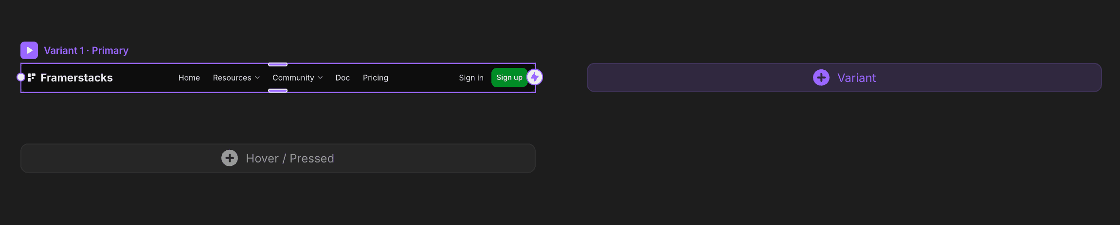
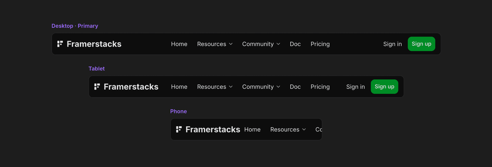
To add a new variant, click on the add variant button. It will prototype a new one. Name it to identify the variant easily for further customization purposes. Here, we will create 3 variants. Each for specific breakpoints (Desktop, Tablet, and Phone)
Now the component and variants are ready. Just optimize the navigation component to improve the visual hierarchy, as well as the UI parameters.
Optimize the navigation bar
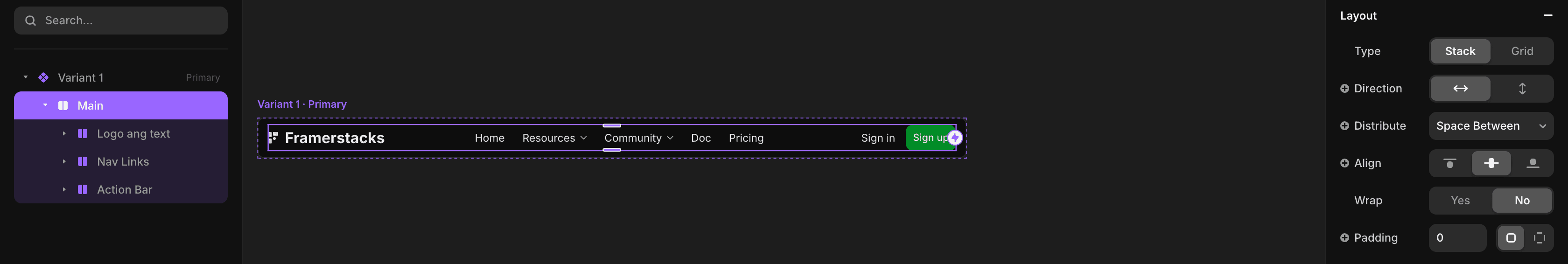
Let's keep it simple, clean, and perform fast. We're going to apply the auto layout feature that will help a lot to optimize the navigation bar across all the breakpoints.
Of course, the primary variant will be the first one, and the rest of the variants are considered to be children.
All the changes or customization you make on the primary variant will be auto affected to the child variants. Whereas, any changes make on the child will be affected itself only.
To optimize it properly and distribute the logo, texts, and buttons equally on the available space, use the Space Between property. Boom, all the elements are distributed to the available space with equal spacing.
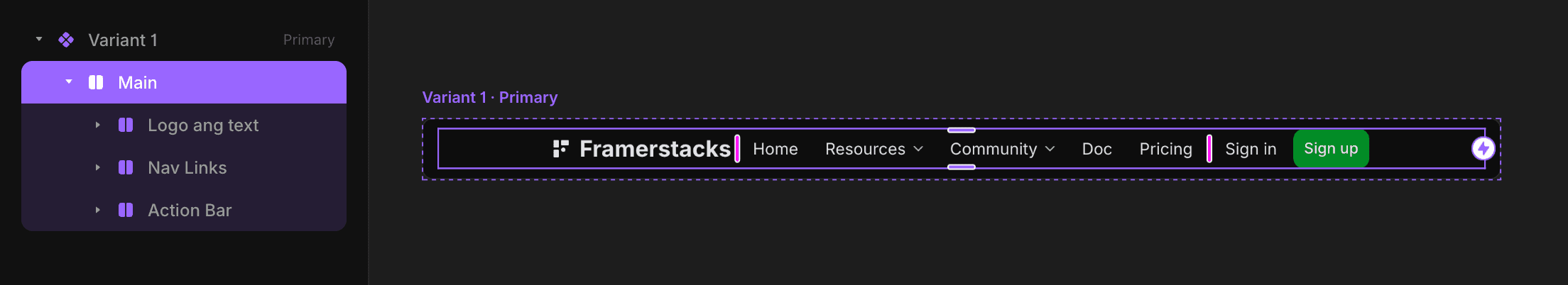
But, this doesn't look great. We have to make it more visually optimized by adding a certain group of elements to a stack. For instance, the logo inside a stack, similarly, the text buttons are inside a stack, and the CTA buttons are on another stack.
Group the elements inside stacks
Firstly, select the logo and wrap it in a stack.
Shortcut: Option + Command + Enter This will create a stack with the width Fill property. Change the width to Fit instead of Fill. Repeat the same practice to group the other elements.
Optimize for mobile devices or small screens
When it comes to optimizing any component or section specifically for small screen sizes, it requires extra effort in Framer. The auto layout functionality or changing the layout distribution style will not function properly. Here we put forward a unique strategy that's simple and efficient. Just hide a stack and create an alternative for the phone variant.
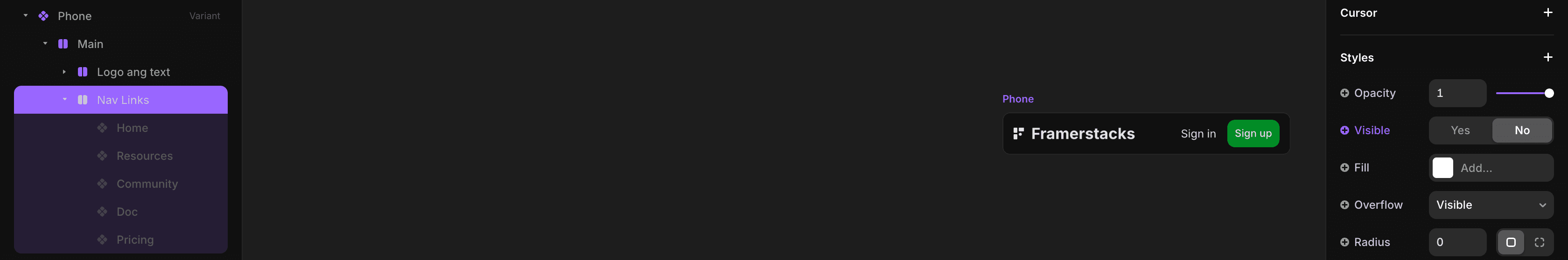
Head over to the phone variant and set the visibility to NO for the stack that contains the text buttons (Menu buttons). Now, it may look good. Only the Logo and CTA button with a variant width size 390px. Pretty cool…
However, the mobile variant required special interaction for the navigation bar. Open and close functionalities with a simple hamburger component. Let's create it.
Add open and close variants
It requires creating one more variant for the mobile breakpoint with an animating hamburger or menu button. Only these two variants need to connect each other via a hamburger button to perform the open and close functionality. The close variant to display the Logo, CTA buttons, and the open variant for additionally displaying the menu options (Page navigation)
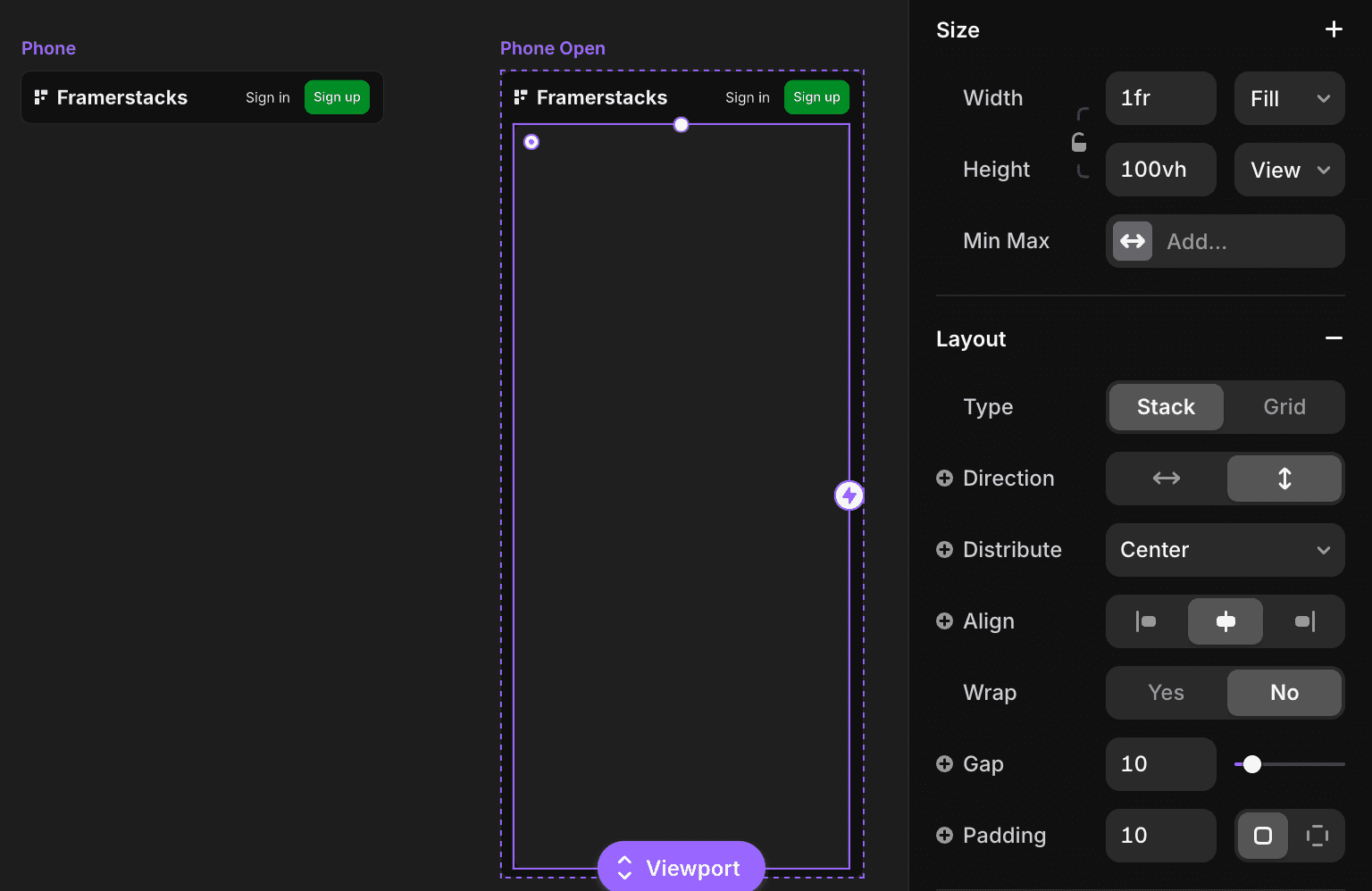
Create a fourth variant and name it "Phone Open". Then draw a frame, name it, and place it inside the variant. Set the following properties for the recently added frame.
Width= Fill
Height= Viewport (100vh)
Fill color: Add any fill color that matches your design system
Layout= Enable
Type= Stack
Direction= Down
Padding= 10
Once all set, add text buttons and social links to this stack. Connect with proper linking to navigate users efficiently.
Connecting mobile variants
The nav bar designing stage is just half part. The other main part is connecting the mobile close and open variants with a smooth effect. To do that, we need a special component hamburger or mobile menu icon. Check out some of the cool component collections here.
Pick any one of them and paste it into the stack containing the logo and CTA buttons. Then, wrap the component in a stack. For the mobile close variant, it should be the hamburger, and on the open variant (variant - 4), change to close, cross, or X icon.
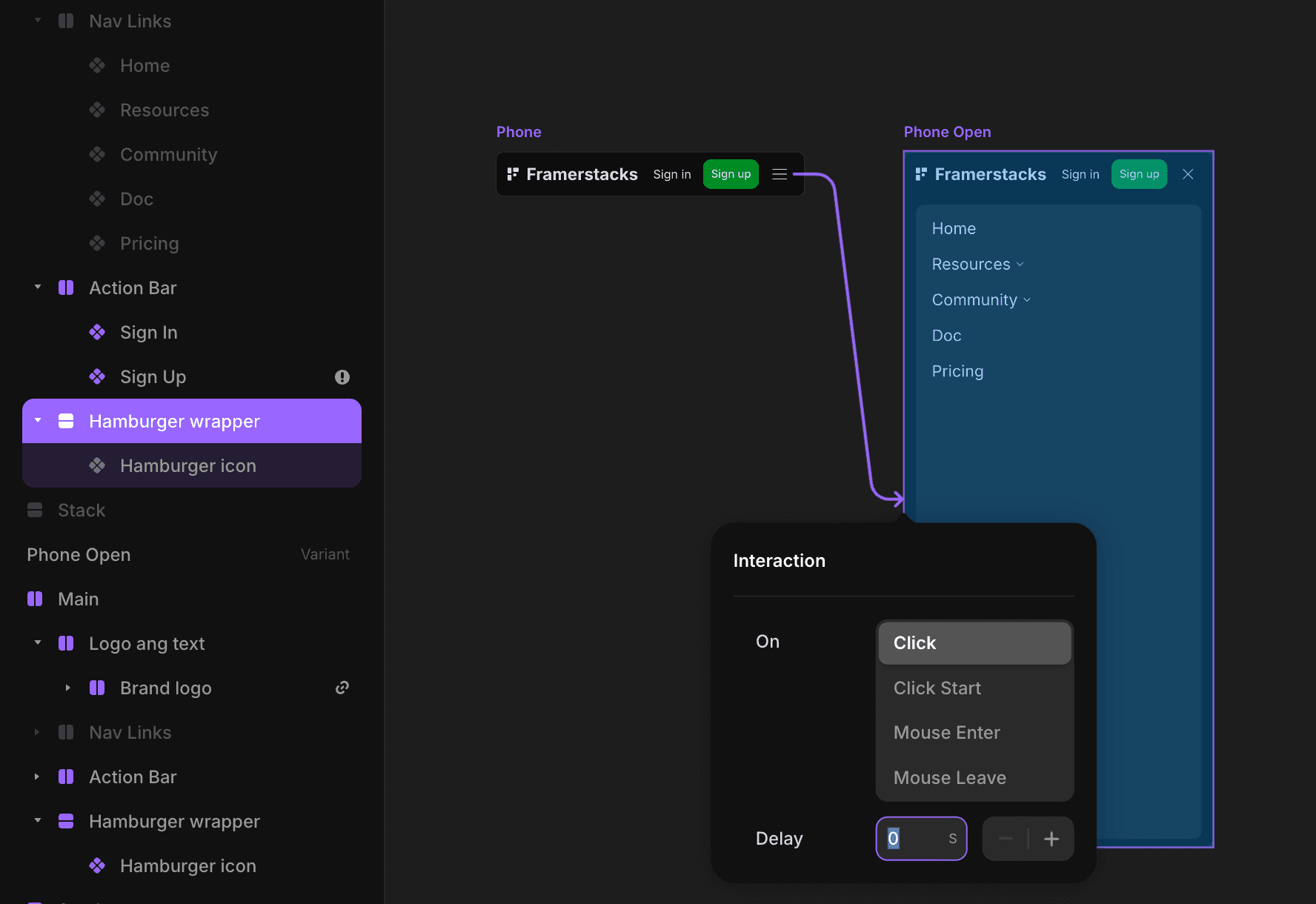
Once all set, connect the wrapped stacks (hamburger wrapped stack) each other to function the mobile navigation bar perfectly. Double-click the hamburger menu to edit further or change the way the components animate while hovering, clicking, etc.
Test across devices
Basically, we created 3 variants plus 1 for the mobile open version. Each variant represents each breakpoint, except the 4th one, because the 3rd and 4th variants function on the mobile breakpoint accordingly.
Assign the first variant for the Desktop breakpoint, and the second one for the tablet, then 3rd variant for the mobile breakpoint. Come back to the desktop breakpoint and complete the following settings.
Primary variant position= Fixed
Pin top position= 10
Width= 100% (Relative)
Max with= Set a max width
Z index= a value not less than 5
After setting these measures, preview the screen and resize the screen size to visually test the functioning of the newly created navigation bar. The nav bar will auto change from one variant to another based on the screen aspect ration changes. Overall, a fully responsive, simple, and clean navigation bar is ready for your Framer website.
Things to focus before the finalization
Never compromise the design quality of the navigation bar as well as the key performance.
Links - Never add too many links to the navigation bar. It makes it cluttered and hard to scan the proper guidance. We recommend to add the most important 4 to 6 maximum links for a clear structure. If you have more links, arrange them inside a dropdown or leave it to the Footer section.
Ignoring mobile optimization - Understand that most of the traffic comes from mobile devices. So, the full responsiveness of the mobile nav bar is the key task. All the menu options are arranged in horizontal position also impossible; it breaks and becomes unusable. So, exactly implement the optimization steps mentioned above.
Color contrast - Make a balanced color contrast between the nav bar fill color, texts, and CTA buttons. An unoptimized contrast ratio may cause visual impairments. This also affect on the Google page speed parameters.
Test across devices - Double-check the adaptiveness of the navigation bar across different devices. It may break on tablet or mobile devices if the elements are not organized properly. Use the stack and auto layout functionalities mentioned under previous headlines.
Final thought
Creating your first fully responsive navigation bar on Framer is an easy task. It does not require writing a single line of code. All you need to learn is stack and auto layout. With a simple enthusiasm, idea, and dedication, anybody can simply craft a professional navigation bar that enhances usability and conversion.
Happy building…
Video guide
Watch the video below to understand how you can simply craft a fully responsive navigation bar for your website on Framer. This video will cover drawing stacks, optimization, component, prototyping, interaction, and may more.
Got an article suggestion? Let us know