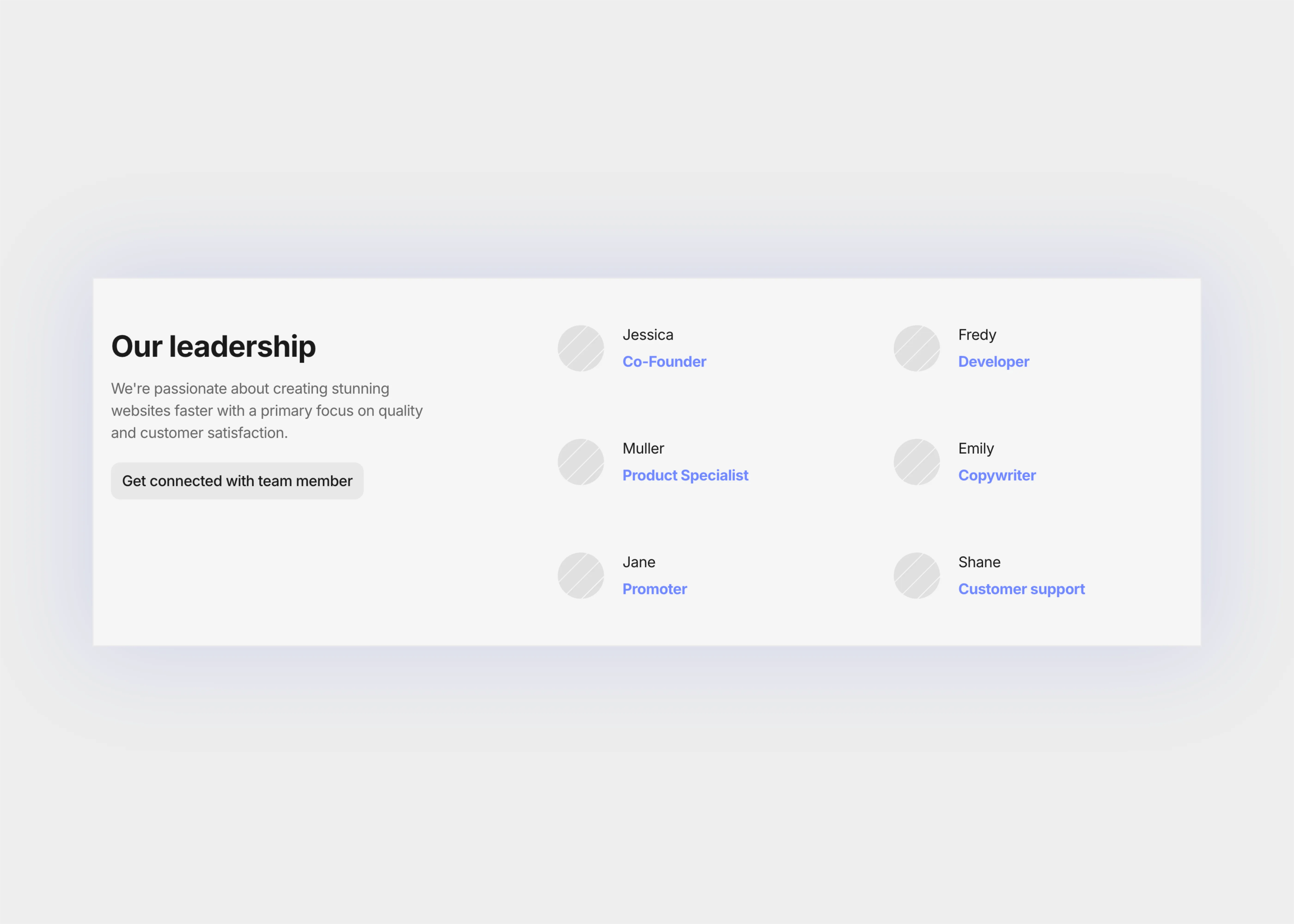
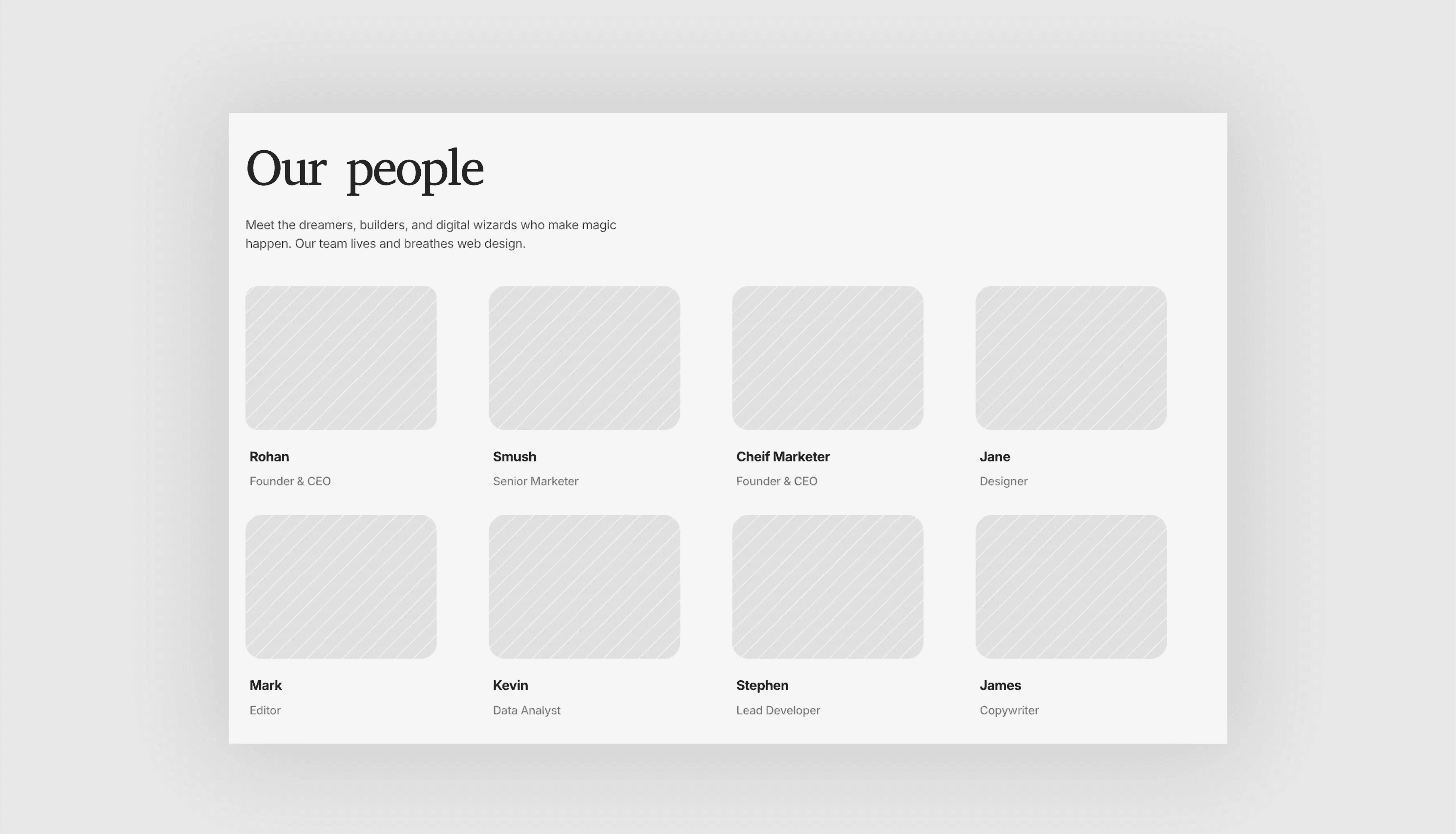
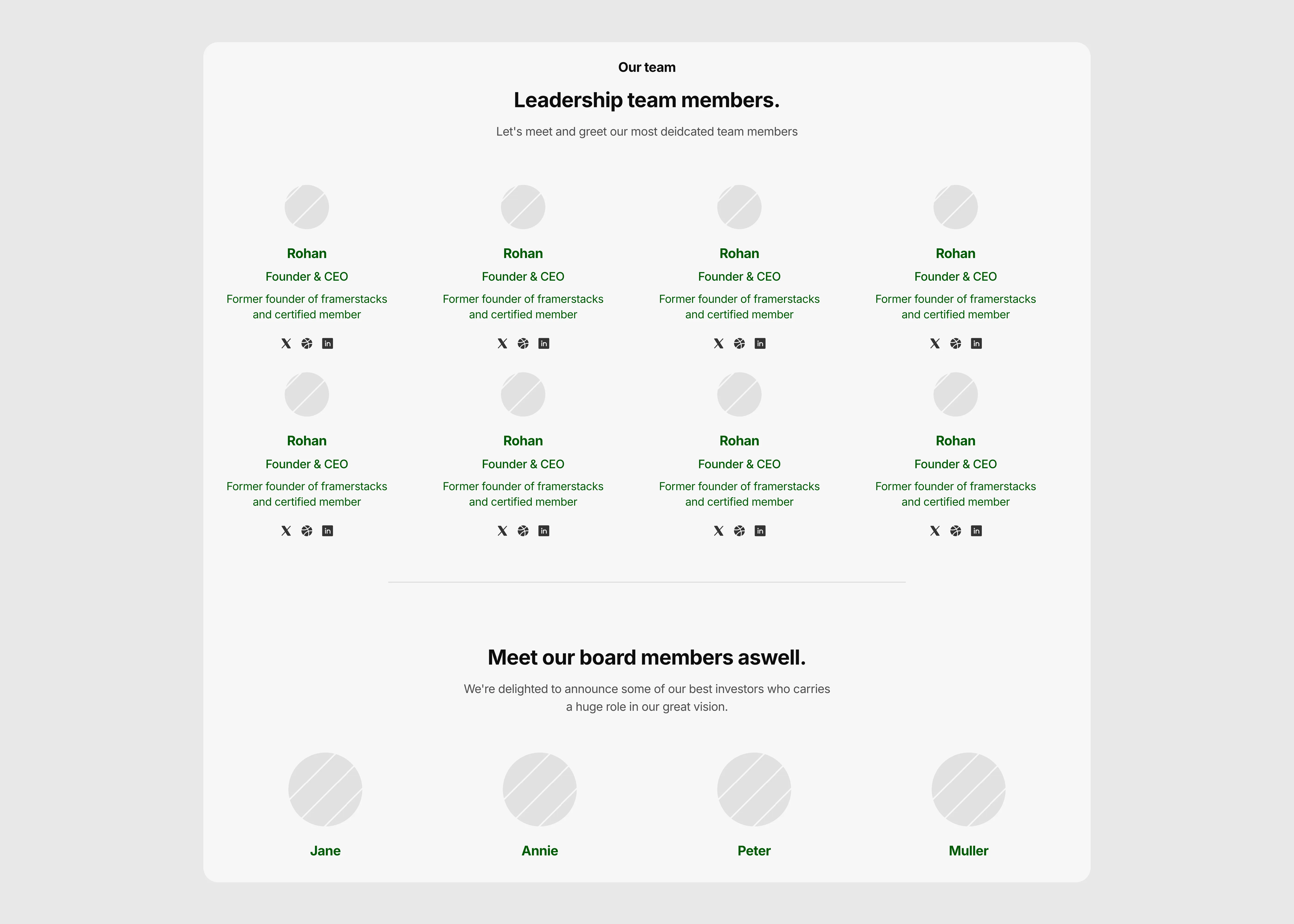
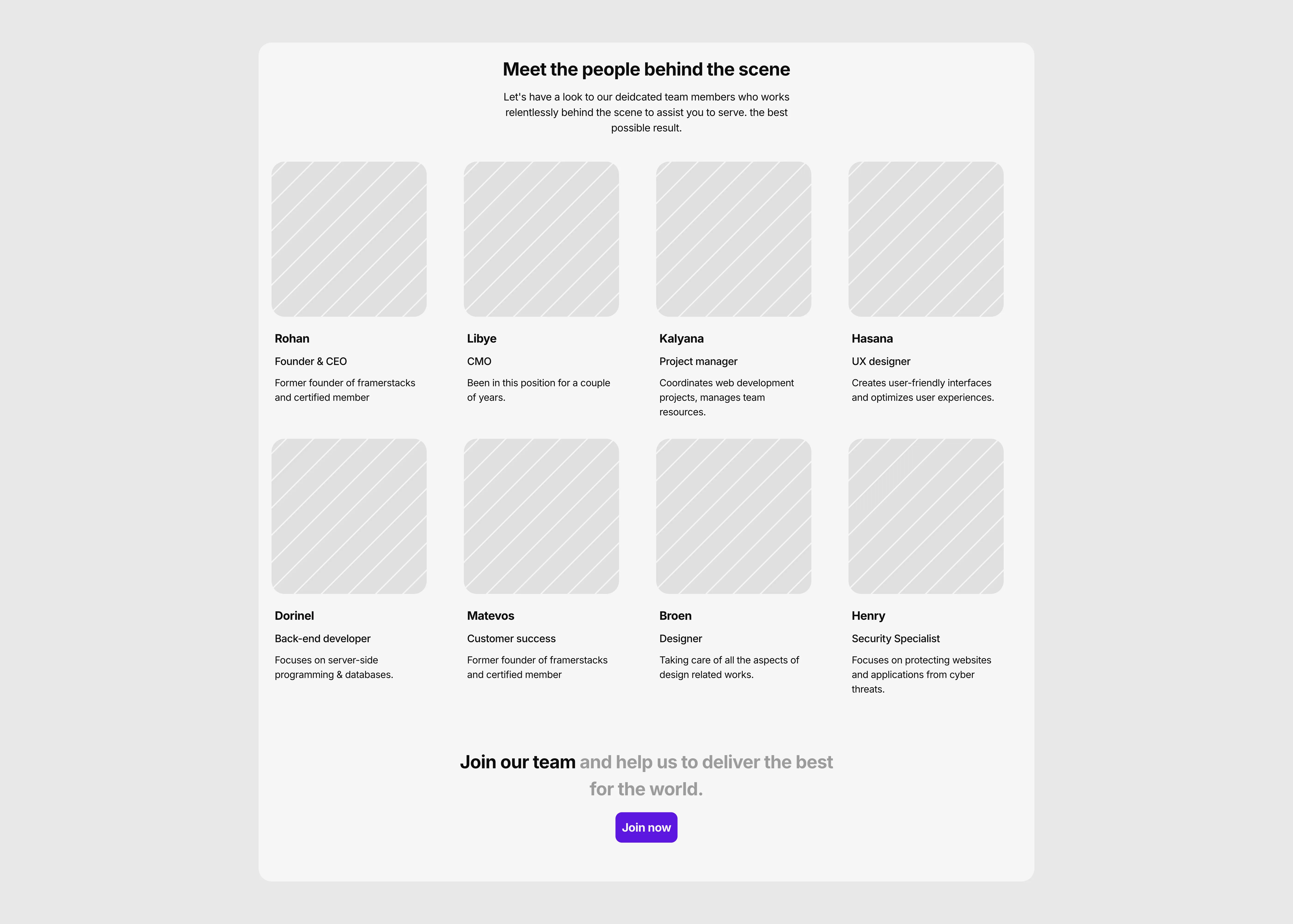
A light themed team section for Framer sites.

Last updated on:

Updated on:

Available variants

A dark themed team section for Framer sites. The UI optimized for desktop devices.
A dark themed team section for Framer sites. The UI optimized for tablet devices.
A dark themed team section for Framer sites. The UI optimized for phone devices.
A light themed team section for Framer sites. The UI optimized for desktop devices.
A light themed team section for Framer sites. The UI optimized for tablet devices.
A light themed team section for Framer sites. The UI optimized for phone devices.

Team Section with Hover Portraits and Hiring Card

This team section for Framer introduces a studio crew in a clean four-column grid built for about pages. Black and white portraits turn to color on hover and reveals LinkedIn and X links.

...
...

Variants:

6

Breakpoints

Theme:

Please note: This component is available only for active license holders. Sign in with your license key or purchase one.

Copying disabled

How to use the component?

  • Copy this component to your clipboard, then paste it into your Framer project. The section arrives with its Team 6 Member card component attached.

  • Unable to copy? Sign in and try again.

  • Photos and names: click a card and use the right panel. Photo, Name, Role, Place, and Number are all card properties, so you never dig into layers.

  • More people: duplicate any card inside the Grid frame and fill in the new properties. Remove cards the same way; the grid closes the gap.

  • Hiring card: rename the three roles, swap the cities, and point the card link to your careers page. Delete the frame entirely if you are not hiring right now.

  • Header numbers, intro text, and office addresses are plain text layers you can overwrite directly on the canvas.

  • Hover behaviour: photos sit in black and white, then turn to color and zoom slightly while a soft fade reveals the person’s note and their LinkedIn and X buttons.

  • Phones skip hover. The phone variants use the Touch card, where photos stay in color, and the social buttons are always visible.

  • On tablet, the hiring card stretches across two columns so the last row never leaves an empty slot.

  • Spacing follows a strict 10px rhythm, so it lines up cleanly with most layouts.

Where to use?

  • A natural fit for the About page of an agency, studio, consultancy, or startup that wants clients to see real faces before they get in touch.

  • It also works as a recruiting moment: lead into it from your company story, then hand off to a careers section so the hiring card has somewhere to go.

LIMITED TIME OFFER

Launch amazing websites with

Framerstacks

Still trying to design and launch a website from scratch? Check out 800+ pre-built Framer components and sections that 10x your design speed.

Life time access

Save hundreds of hours

10x design speed

Weekly new releases

Premium designs

Color theme responsiveness

Starts from

$79.00

$99

One-time

Library overview

Framerstacks hosts one of the largest collections of pre-built Framer components and website sections. With 270+ professionally designed components and 1000+ variants.

Our library spans 120+ webpage section categories, enabling creators to build beautiful, high-performance websites in Framer faster than ever.

Explore the main library page.

Contribution

Have something creative on your mind? Or wish to become a contributor inside Framerstacks?

You're welcome. Join as a contributor and help to shape the future of the high-quality Framer components and sections gallery. Head over to the submission page and contribute.

Support

If you need any further support related to this specific component or section, please get in touch at hello@framerstacks.com

One of our customer support team members will get in touch with you within 24 hours.

To report an issue with the product, purchase, functionality, submit a ticket.

Just like more components
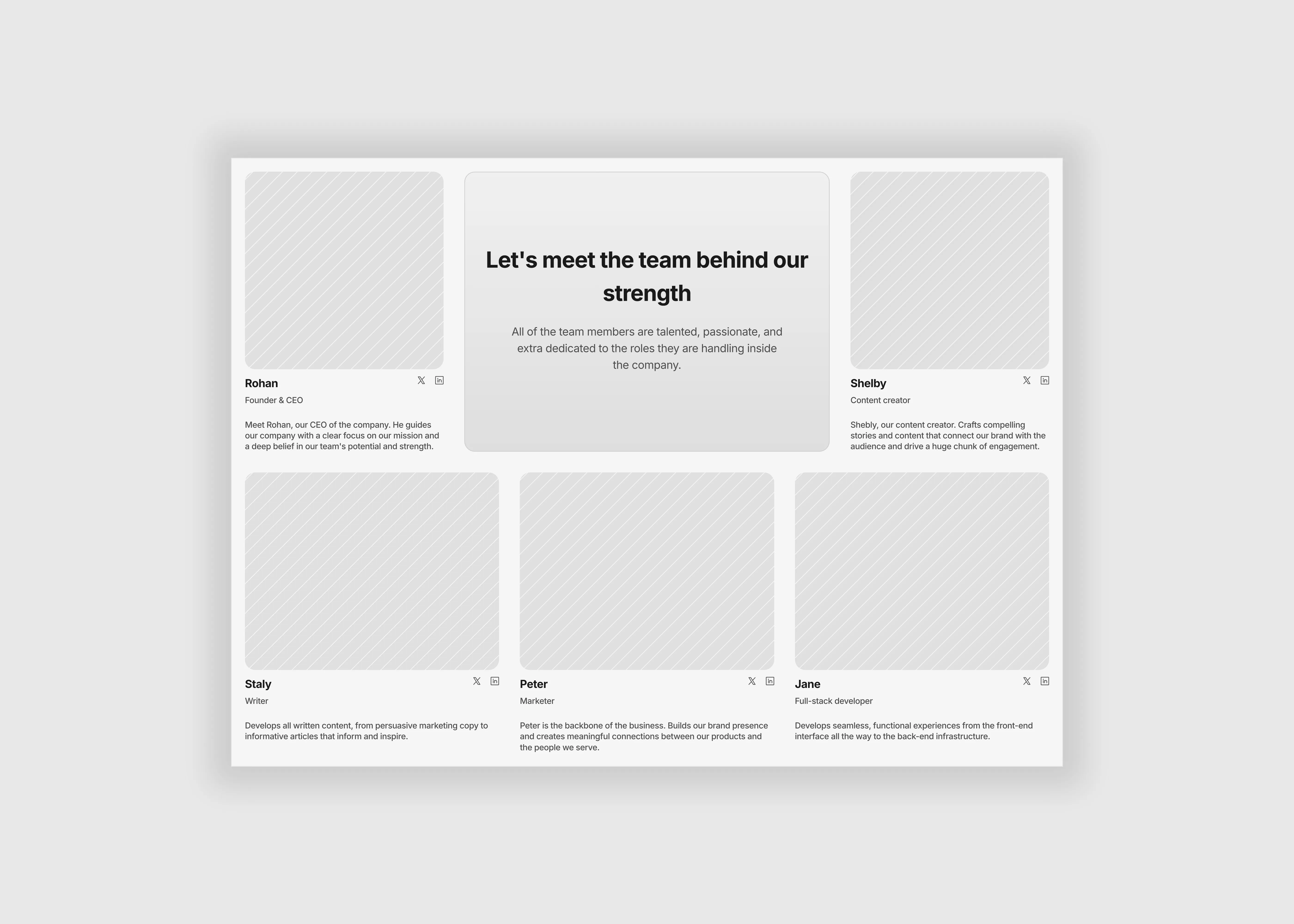
Leadership Team Section for Framer Websites

Aug 14, 2026

Team Section for Framer Websites Compact Grid

Aug 15, 2026

Team Section for Framer Websites Card Grid

Aug 15, 2026

Team Section with Social Links for Framer

Aug 15, 2026

Team Members Grid Section for Framer

Aug 15, 2026

The FAQs

Have questions? We got you…

Everything you need to know about our product and billing.

What is Framerstack?

Is there a free plan available?

What about the refund policy?

How I can avail my user license?

Still have questions? Or can't find the right answer? Please contact us. One of our customer support team members will get in touch with you.

Join to the community

Stay in the loop with everything you need to know.

By clicking Submit, you agree to our Privacy Policy and to receive our notifications. You can Unsubscribe anytime.

By clicking Submit, you agree to our Privacy Policy and to receive our notifications. You can Unsubscribe anytime.