How to Add Creative Page Transitions to Framer Projects

By
A. Rishad
Founder @framerstacks

800+ section & components
Components every week
50+ Custom forms
Complete UI kit
CMS collection
Premium templates
One-time payment starts from
Sign in, if you already have an account.
Have questions? Contact us



If you searched "how to add page transitions in Framer" even a few months ago, the honest answer was "you can't, not really." That has changed. Framer now ships a built-in feature called Page Effects, built on the browser's View Transitions API, with presets like crossfade, wipe, circular mask, blinds, zigzag, and inset that you apply from the Effects panel, either globally or targeted to specific pages.
So the question is no longer whether Framer can do page transitions, it's whether the native feature is enough for what you're building, or whether you need something with more control and broader reliability. I went down both roads while building Framerstacks. What follows is what I learned: what Page Effects does well, where it and the DIY code-override route quietly fall apart, and the checklist I use to judge whether a transition setup actually holds up in production.
What Framer's built-in Page Effects can (and can't) do
Framer's Page Effects are a genuine step forward. You add them from the Effects panel, apply them globally or target specific pages, and choose from presets like crossfade, wipe, circular mask, blinds, zigzag, and inset. You can adjust direction, duration, easing, and mask width, and even customize the enter and exit animations separately. For a lot of sites, that's genuinely enough.
The catch is what they're built on. Page Effects sits on top of the browser's View Transitions API, which isn't supported in every browser or version yet; where it isn't, the effect simply doesn't play and visitors quietly fall back to a plain page load. You're also limited to the presets Framer ships: anything outside that set isn't available, and behaviors like reduced-motion handling are managed for you rather than something you control.
This is where our Page Transition Manager pulls ahead of the native feature. Instead of depending on an API with partial browser coverage, it runs its own animation layer, so the effect behaves the same across browsers and the same in Framer Preview as on the published site.
It ships 15 presets against Framer's handful, treats reduced-motion as a first-class setting rather than a fallback, and, crucially, guarantees that navigation still completes even if an animation ever stalls, so a visitor is never left staring at a frozen screen.
Page Effects is a perfectly good default; Page Transition Manager is what you reach for when the transition has to look right and work reliably on every browser your visitors actually use.
The DIY approach (and where it quietly breaks)
The obvious fix is a code override: intercept the click, cover the screen with an animated overlay, then navigate. It works the first time you test it. Then it breaks in ways that don't show up until real visitors hit them.
First crack: it works live but not in Framer Preview. Preview runs your site inside an iframe and navigates with the History API, no full reload. A transition built around location.assign() paints a black screen in Preview and never resolves, because Preview never does the hard reload the code is waiting for.
Second crack: external links, new tabs, and downloads get hijacked. A naive click-listener intercepts every link on the page, including mailto:, tel:, Cmd/Ctrl-click, and links meant to open in a new tab. Visitors lose browser behavior they take for granted.
Third crack: rapid clicks and the Back button break the animation state. Click two links fast, or hit Back mid-transition, and the overlay can get stuck covering the screen with no way to dismiss it.
None of this shows up in a five-minute test. It shows up a week later, in a message from a client asking why their site "went black."
What a reliable page transition system actually needs
After running into every one of those problems, I started judging any transition setup, mine or anyone else's, against one question: does it hold up in production, not just in a demo?
It has to behave the same in Preview and on the published site. If it only works after you publish, you can't confidently test changes before they go live.
It has to know the difference between your own pages and everything else. Same-origin detection isn't optional; it's the line between a nice effect and a broken external link.
It has to leave new-tab clicks, downloads, and modifier-key clicks alone entirely. And if the animation ever stalls, for any reason, navigation still has to complete. A visitor should never be staring at a stuck overlay wondering if the site crashed.
One more: reduced-motion support. Visitors with motion sensitivity should get a fade or nothing at all, never the full effect by default.
This is exactly the bar we built Page Transition Manager against, so I'll use it for the walkthrough below.
Step-by-step: add smooth page transitions with Page Transition Manager
Setting it up takes about two minutes. Head to the Page Transition Manager listing in our Code components library and copy it into your project.
Place one instance on any page of your Framer project, ideally inside a shared/global component so it applies site-wide with a single edit. It has no visible size on the live site, so exact placement on the canvas doesn't matter.
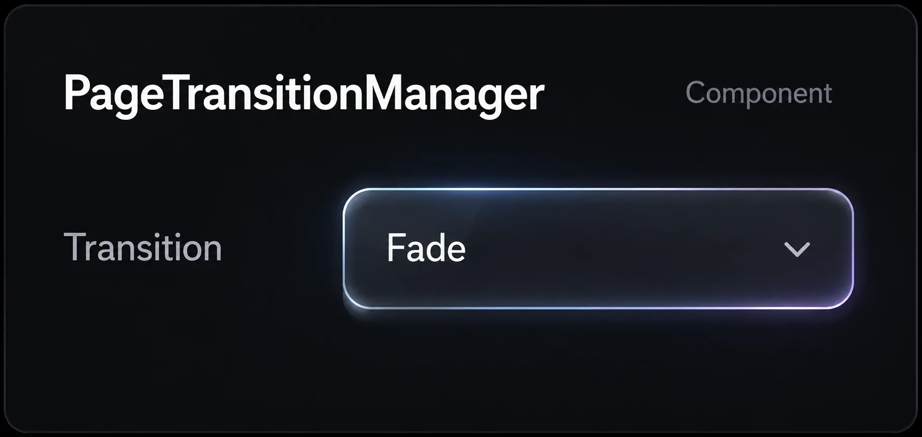
Pick a transition from the properties panel, 15 presets are built in, from a simple Fade to Circle Reveal, Directional Wipe, or a fully Custom curve.
Tune the timing, one overall duration or split Exit/Entry, and choose an easing curve.
Then press Preview and click between your pages. Since it's built to behave identically in Preview and live, what you see while designing is exactly what visitors will get.
Choosing the right transition for your site
Not every transition suits every kind of site, so it helps to start from what the site is actually for.
Agency and portfolio sites tend to want something quiet: a Fade or Curtain reads as premium without calling attention to itself.
E-commerce and product sites benefit from a Directional Wipe between category and product pages, it gives a sense of forward motion through the catalog rather than a jump-cut.
Case studies and project reveals are the one place I'd actually turn the volume up, Circle Reveal or Scale makes the transition part of the storytelling instead of just a housekeeping detail.
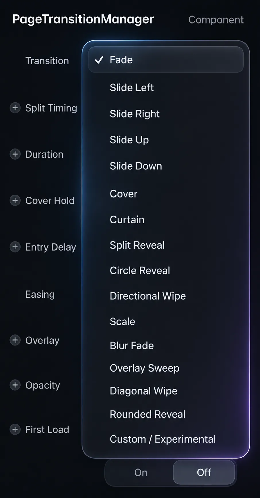
If you're not sure which of those describes your site, start with Fade at a short duration, somewhere around 0.4 to 0.6 seconds. It's the safest default, and it rarely feels out of place.
Common mistakes to avoid
A few things trip people up even after the setup itself is done right.
The most common one is only adding the component to some pages. If a page is missing the instance, links into it navigate with no exit animation at all, which reads as a bug rather than a deliberate choice. The fix is simple, just easy to forget once the excitement of seeing it work wears off.
The second is skipping the Preview test and only eyeballing the canvas. Always click through your actual page links in Preview before you publish.
The third is leaving Reduced Motion on its default instead of picking a mode that respects visitors' system preferences. And the fourth is greed with duration, anything past about 0.8 seconds stops feeling polished and starts feeling like the site is slow.
Final thought
Page transitions are one of those details visitors never consciously notice when they're done right, and immediately notice when they're done wrong. Building a reliable one from scratch means solving for Preview parity, external links, rapid clicks, and failure recovery, none of which are visible until something breaks in front of a real visitor.
If you'd rather skip that process, Page Transition Manager ships with all of it solved. Drop it in, pick a preset, and you're done.
Questions about setup? Contact us, and we'll help you get it running.
Got an article suggestion? Let us know